THE TRANSFORMATIONS. SET BUILDS AND LOCATIONS.
How the magic happens. Design concept through execution.
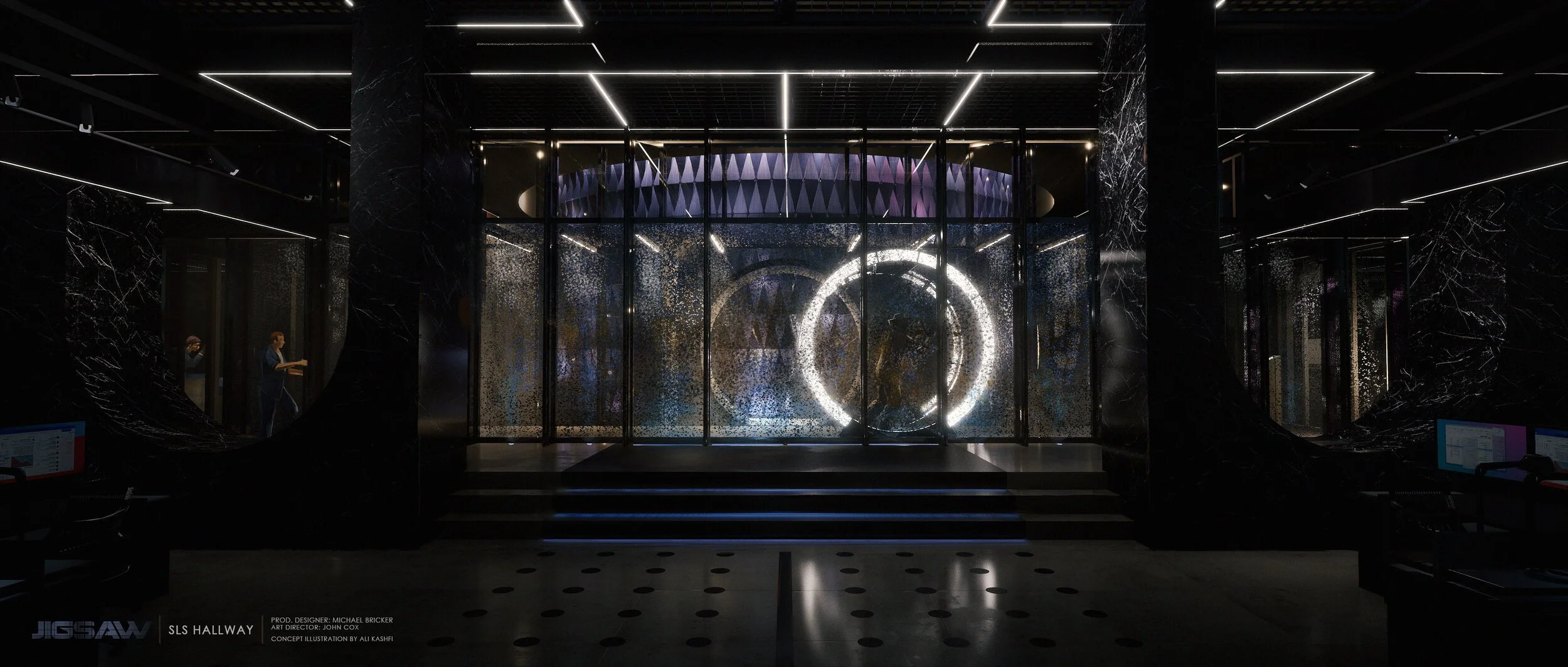
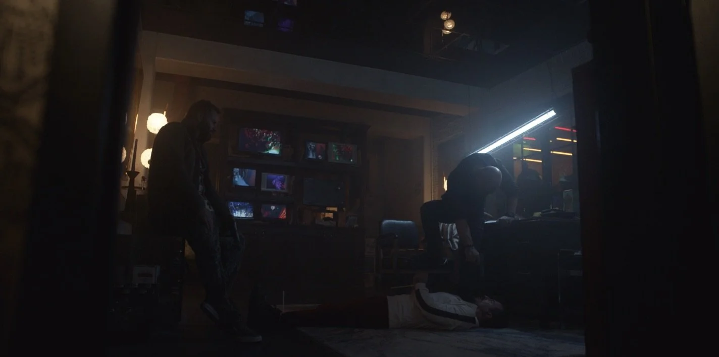
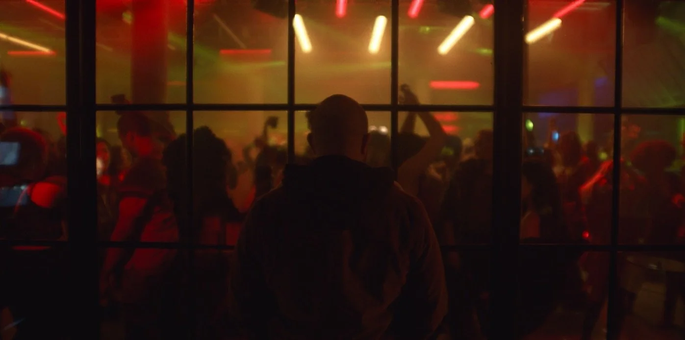
DESIGN CONCEPT // A heist. A jigsaw. 24 years. For this limited series, the audience is invited to watch the story unfold in any order… with episodes organized according to color instead of chronology. This shuffling means that each episode could potentially be the pilot, introducing select events, characters, and spaces, rather than revealing the full picture.
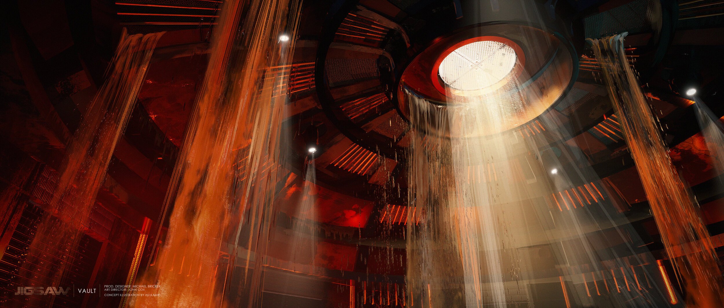
Like all great heists , the core of the show is the vault. Instead of hiding behind steel and concrete, this vault is on display in plain sight, behind a wall of glass. It is a temple. And instead of a typical vault door, this vault opens much like a combination lock, with the various rings sliding into place, revealing a passageway into the inner chamber.
kaleidoscope (limited series)
8 Episodes // Netflix // Created by Eric Garcia, Produced by Automatik and Scott Free
Full page of images here.
Select concept art by Ali Kashfi & John Blood
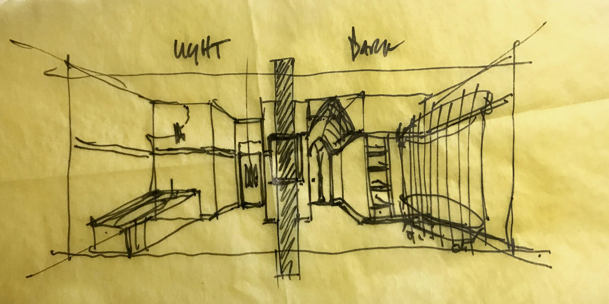
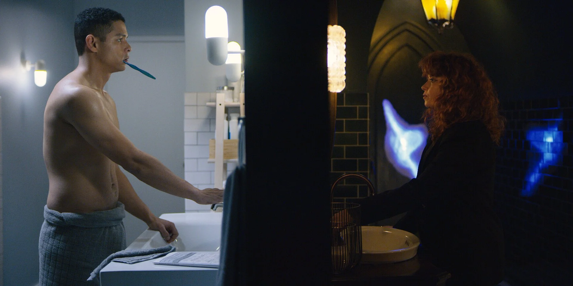
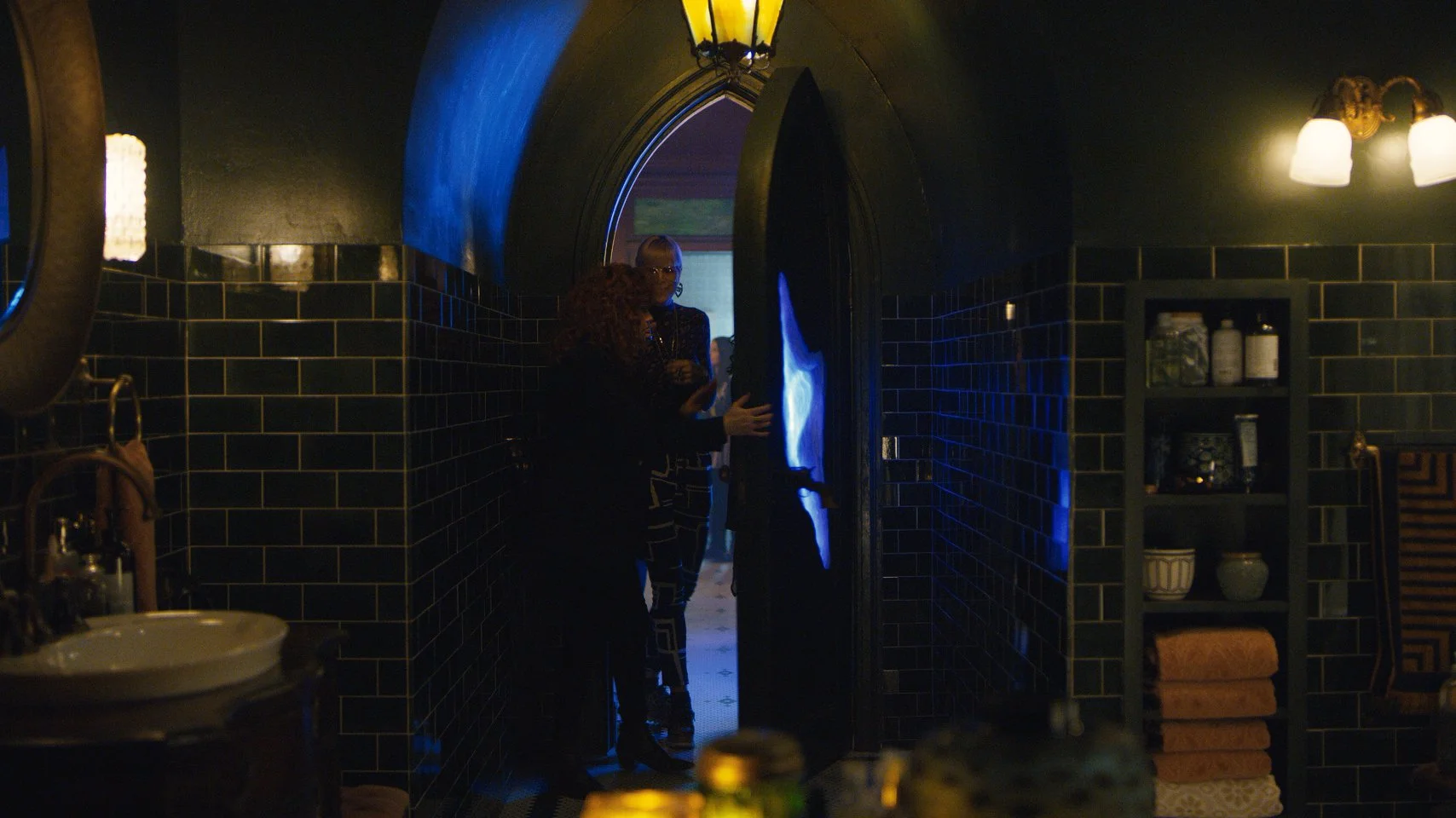
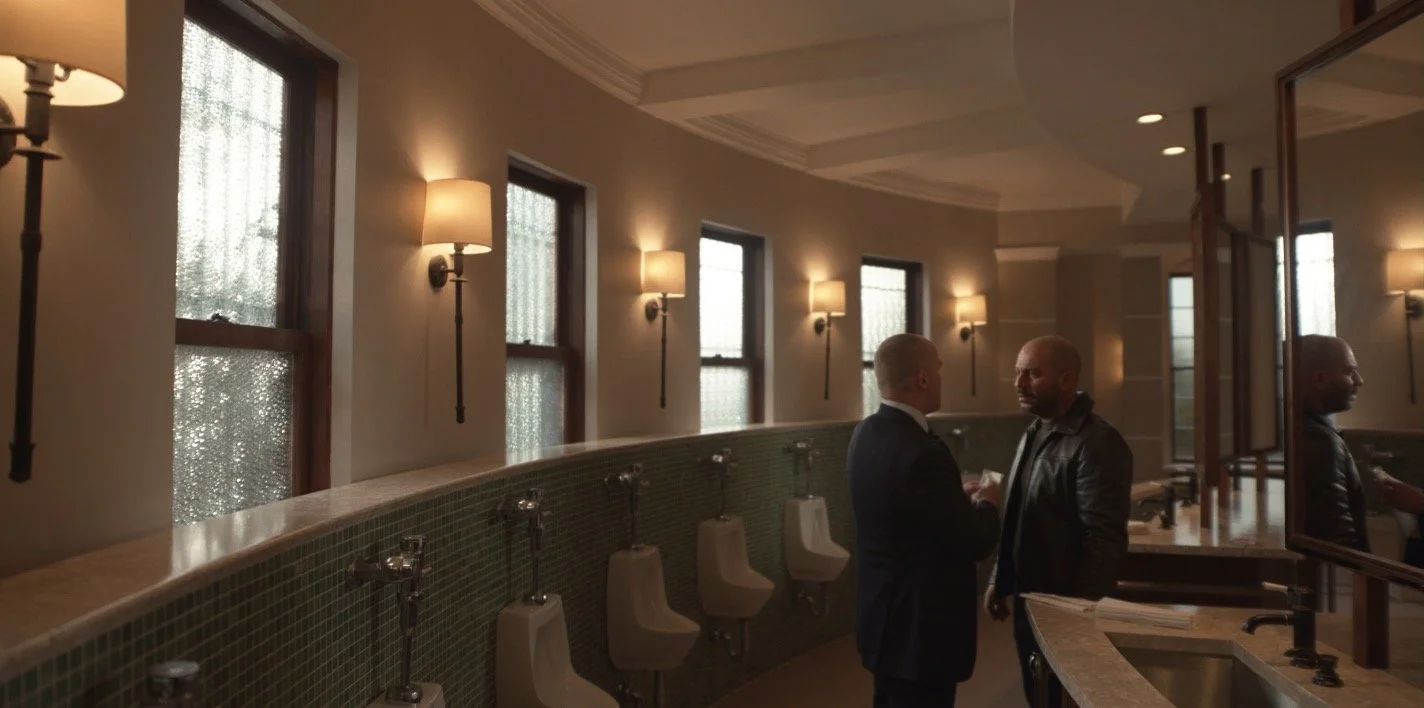
DESIGN CONCEPT // The magic of RUSSIAN DOLL is that everything seems potentially meaningful. Like a good video game, every room, object, and interaction feels like it could lead to a different outcome. The production design of RUSSIAN DOLL stems directly from a few abstract script references to Alice in Wonderland. And while the series is not a take on this classic story, it does at least invite the parallel as we meet Nadia in front of a round mirror, in a dark room, next to a mysterious tunnel. This bathroom is the rabbit hole. The apartment, and all of New York, is Wonderland. As soon as Nadia crosses that threshold - over and over again throughout the series - we gradually realize that the rules of reality are shifted here.
She’s entering a place that is both familiar and unreliable.
RUSSIAN DOLL (S1)
8 Episodes // Netflix // Created by Leslye Headland, Amy Poehler, & Natasha Lyonne
*WINNER 2019 Emmy for Outstanding Production Design Half Hour
*WINNER 2020 ADG Award for Outstanding Production Design
SYFY // A Trip Through Russian Doll’s Award Nominated Bathrooms
VULTURE // The Story Behind Russian Doll’s Bathroom Reset Point
PERSPECTIVE MAGAZINE // Glitching Through the Rabbit Hole
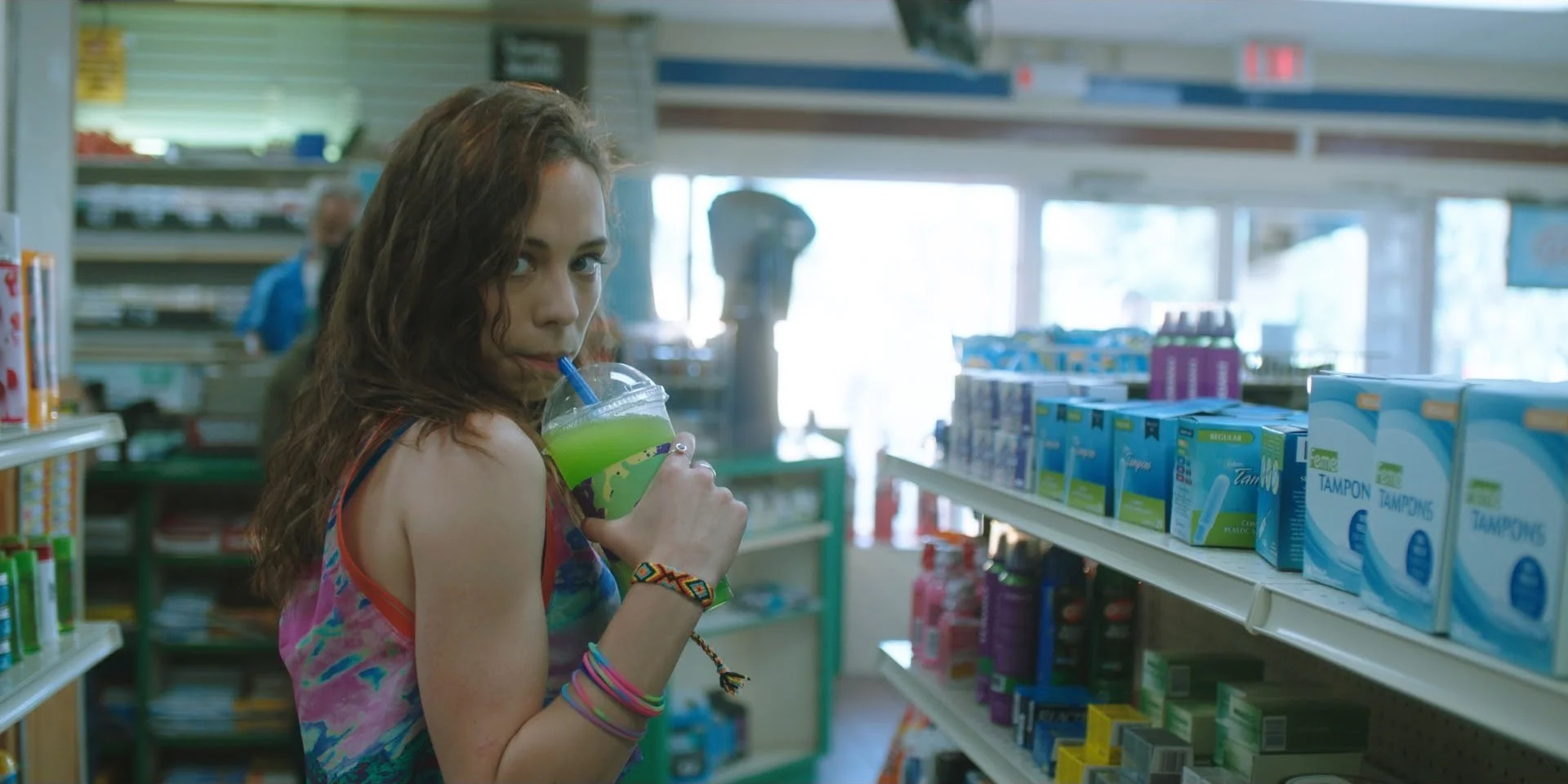
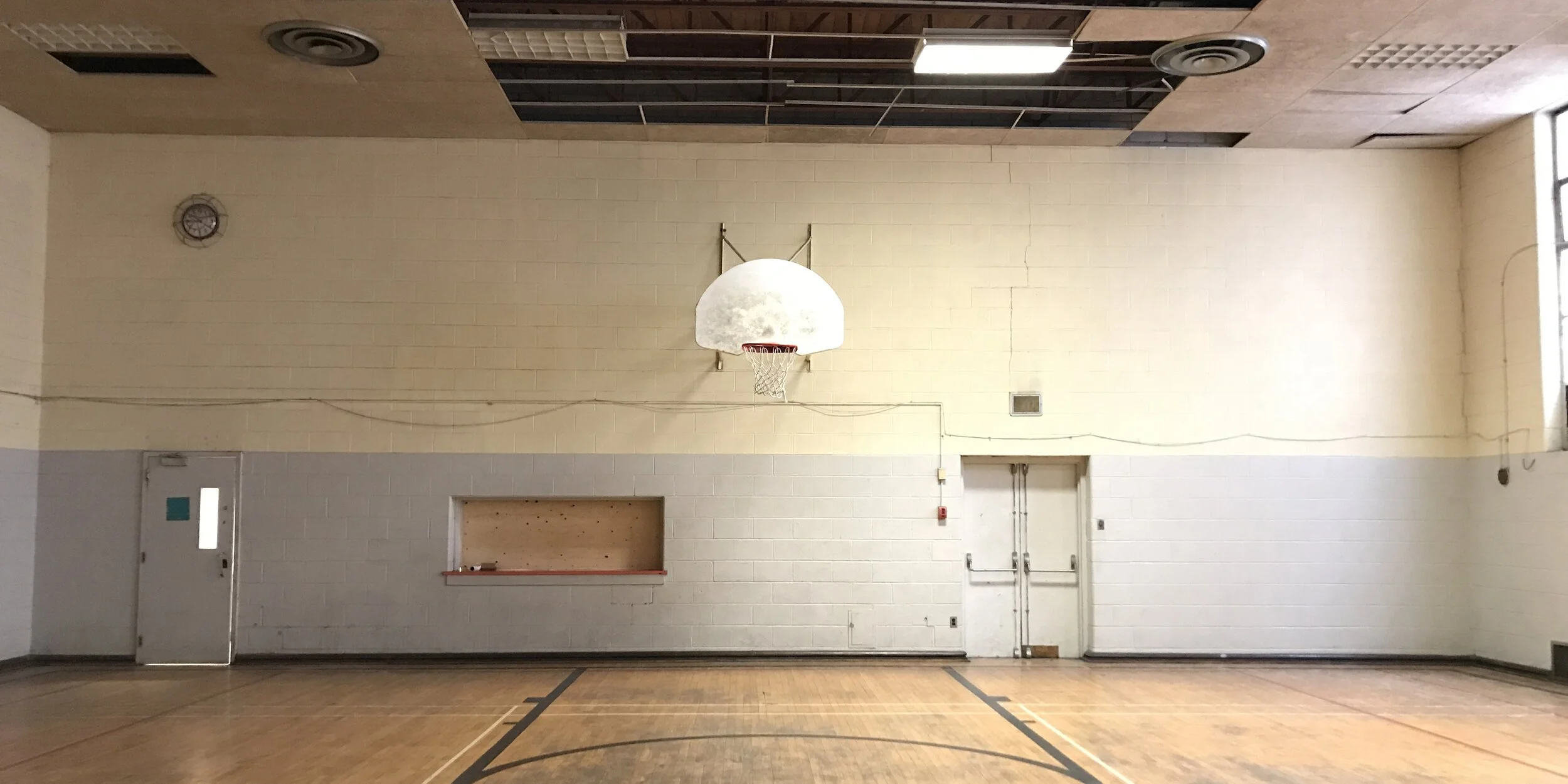
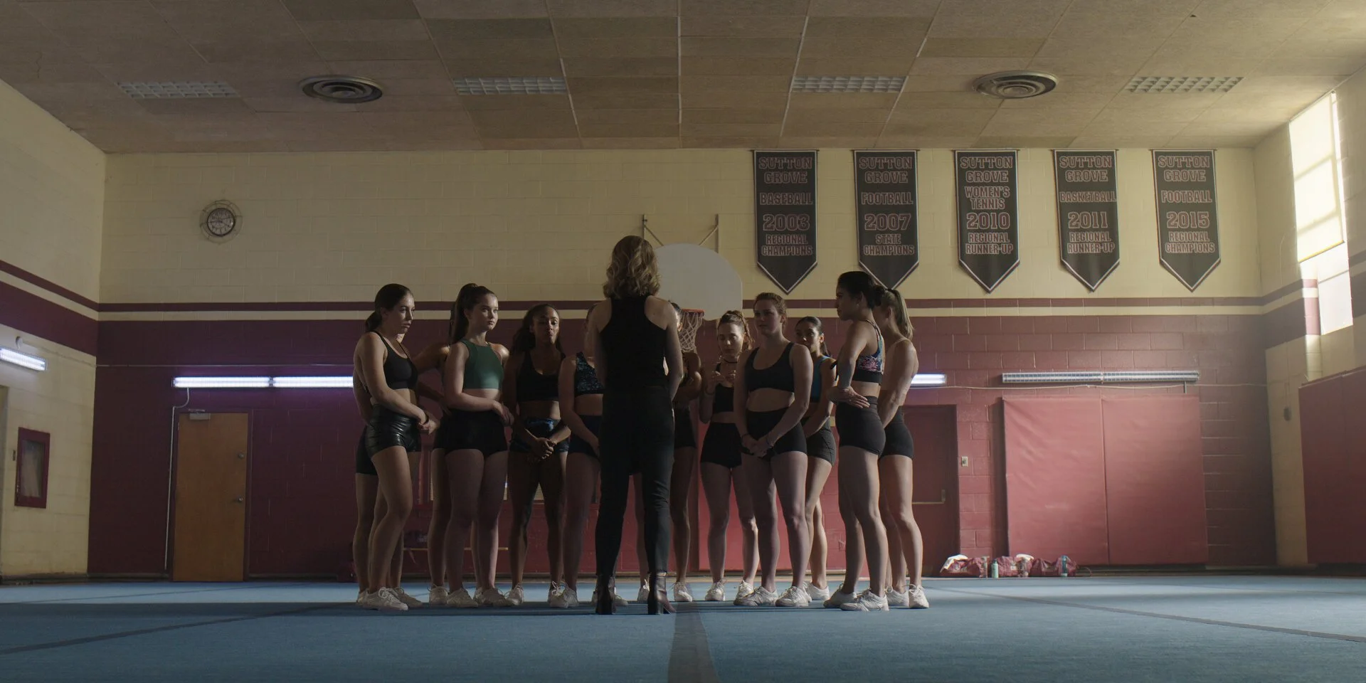
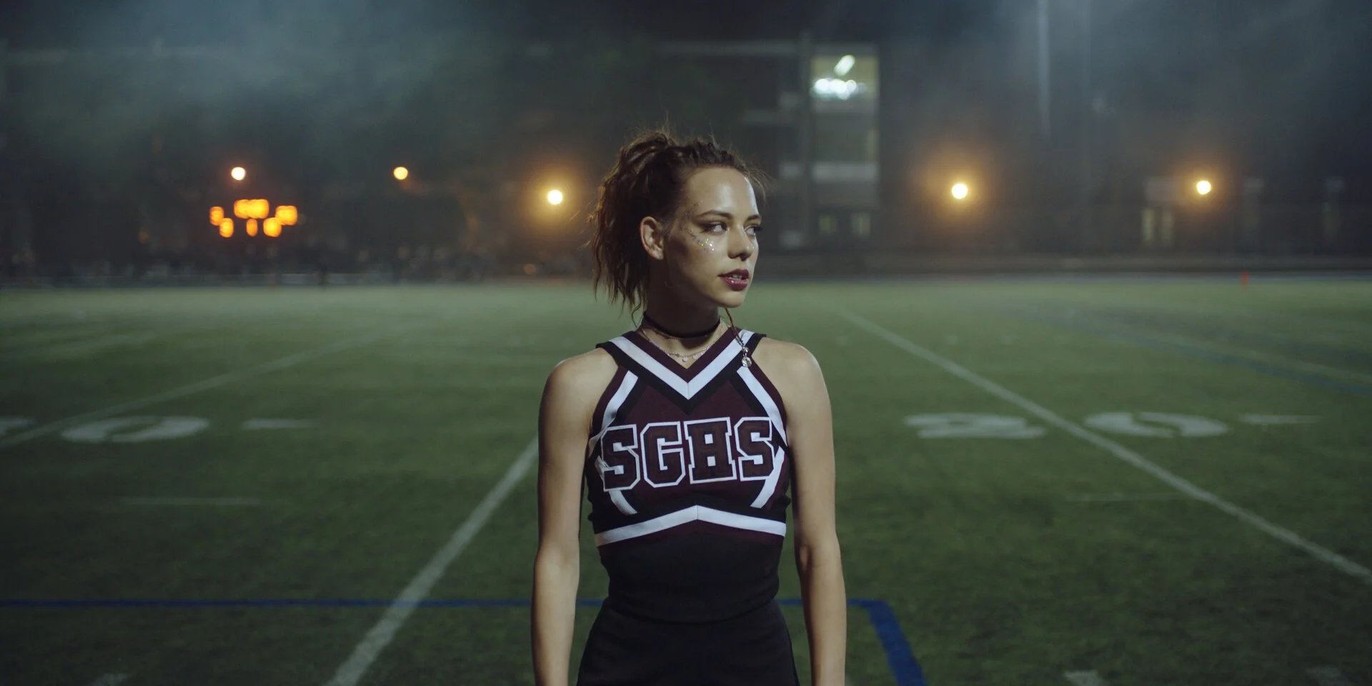
DESIGN CONCEPT // Capturing the ugly/beautiful contradiction of the Midwest is central to the production design of DARE ME - the too-bright fluorescent Walmart next to a decaying downtown. When the camera went wide, we wanted places and spaces to feel vacant and hollow, creating an eerie tone that was at once alluring, noir, and unsettling. We wanted the audience to always feel that something terrible is about to happen.
We presented the cheer athletes as warriors, tougher than the boys, and fully aware of their power. The design embraces the colors of fruit, sugar, and flesh, but as the camera gets closer, the girls reject the gaze, and these colors turn ugly, toxic, and disgusting. Beauty up close can be abject. A zit covered in glitter.
dare me (S1)
10 Episodes // USA/UCP // Showrunners Megan Abbott & Gina Fattore
Based on a book by Megan Abbott // Pilot Director Steph Green // Producing Director Jamie Travis
PERSPECTIVE MAGAZINE // Ugly/Beautiful: The Production Design of Dare Me
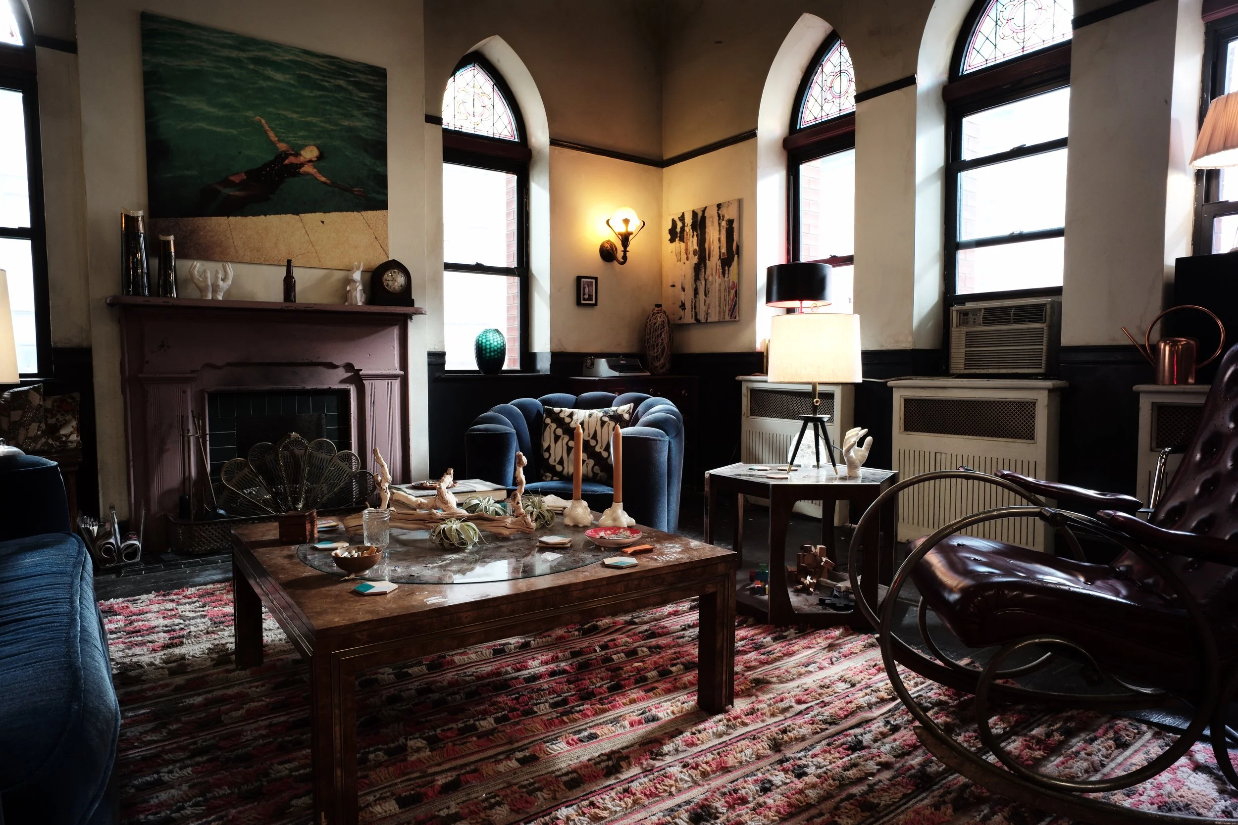
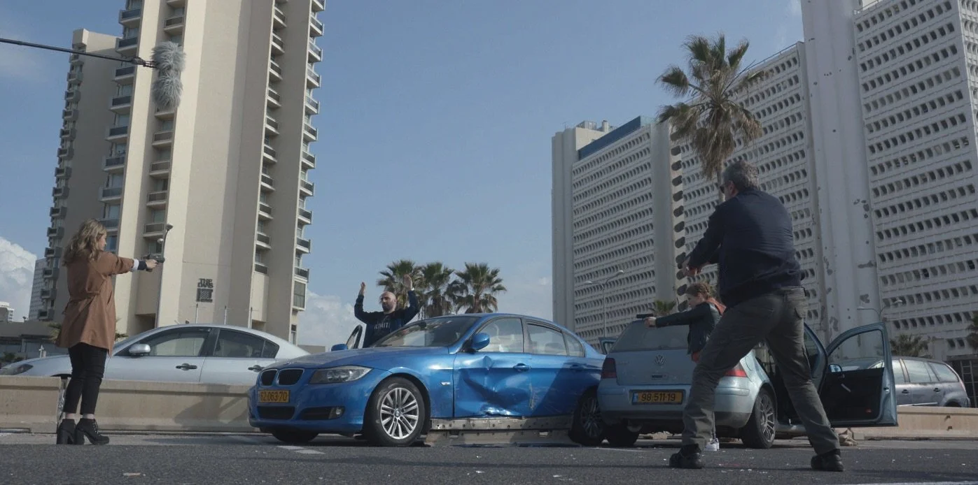
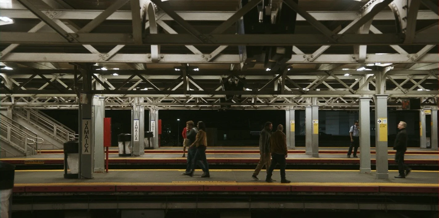
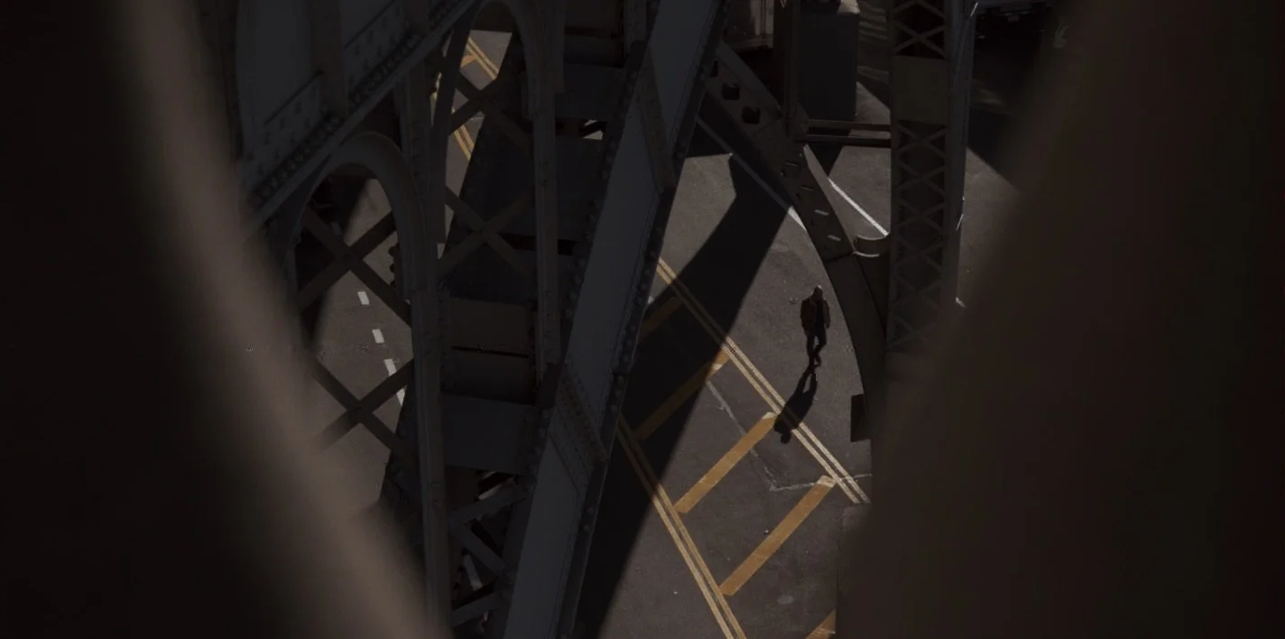
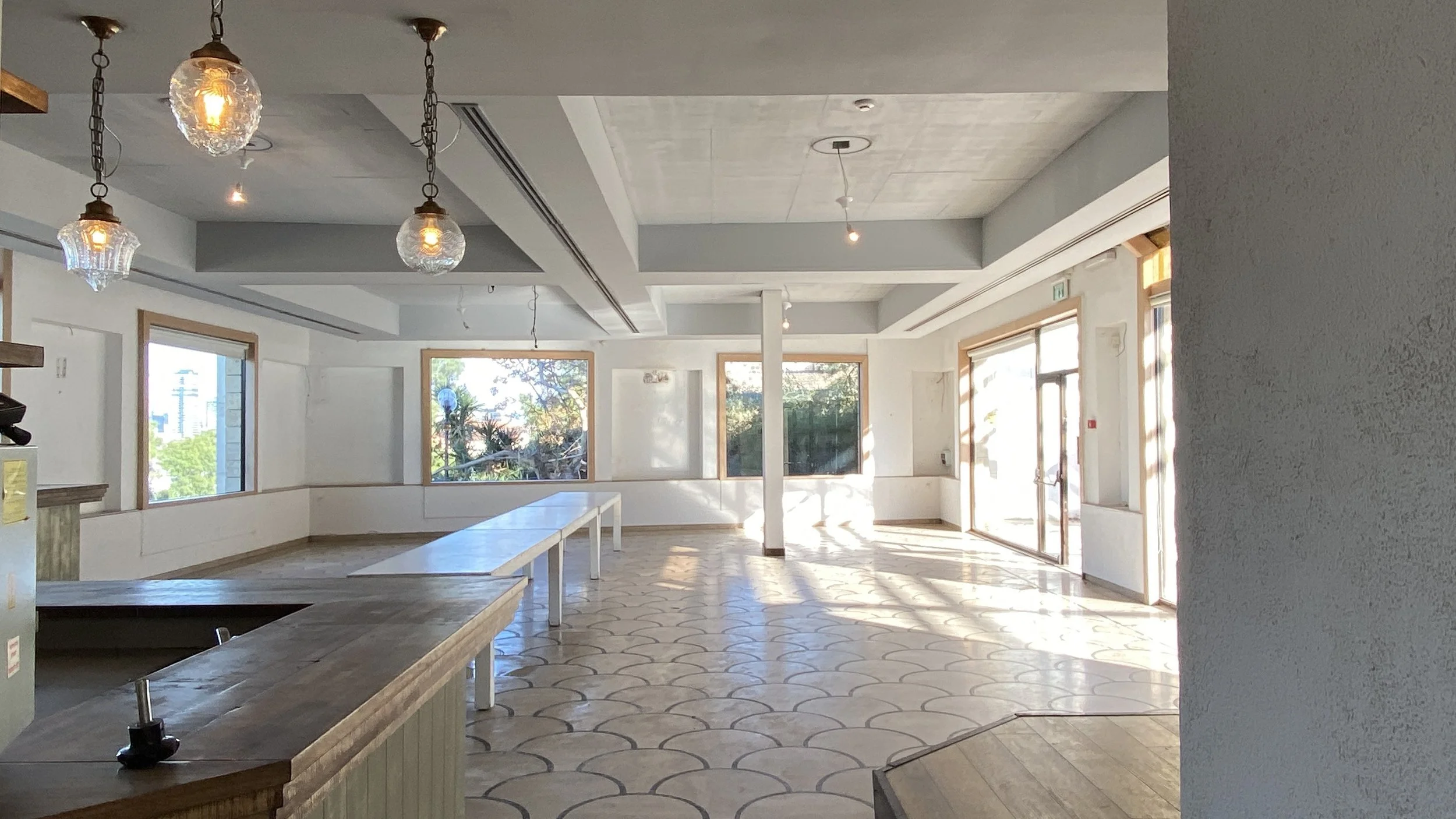
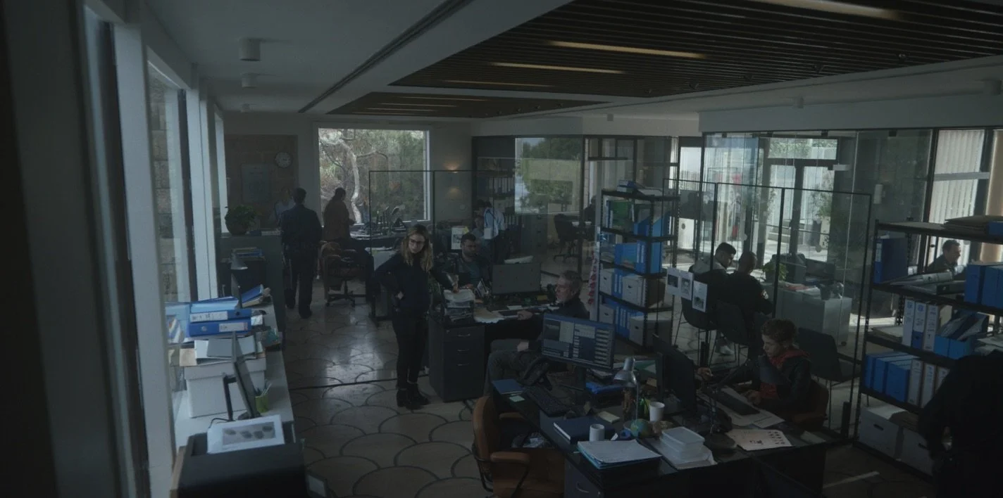
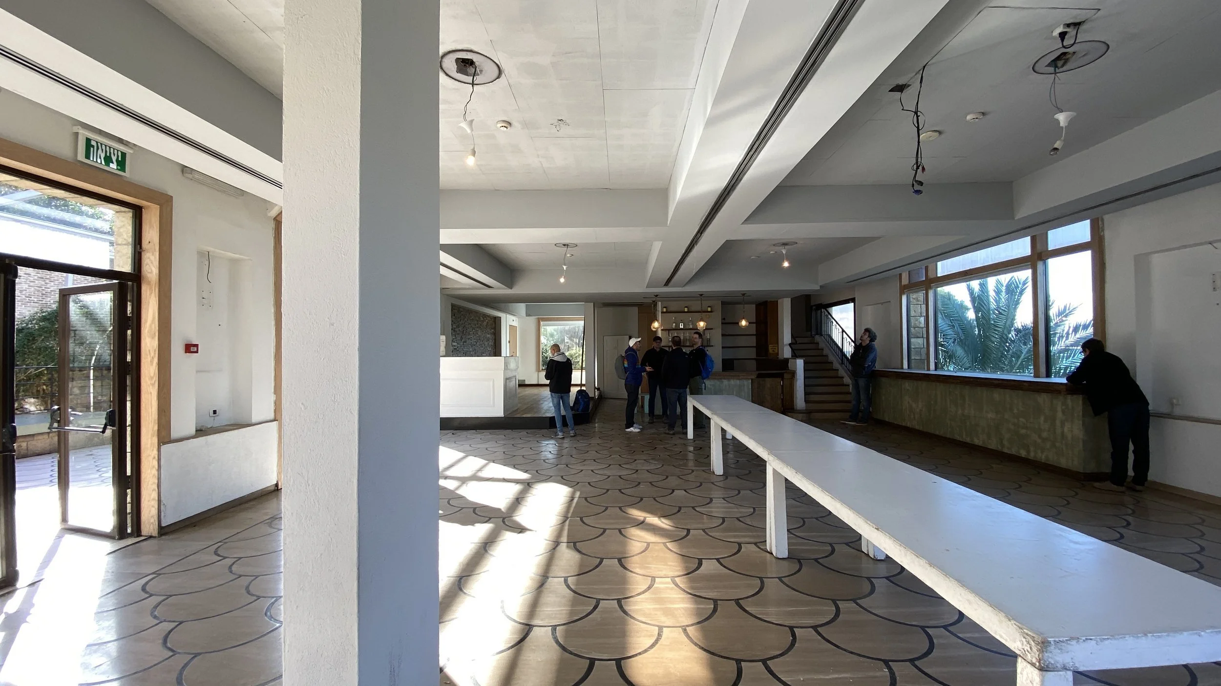
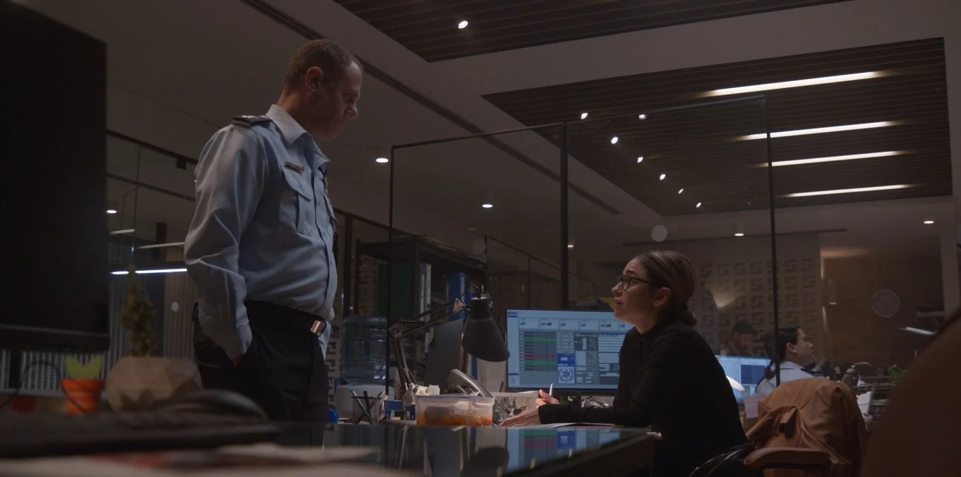
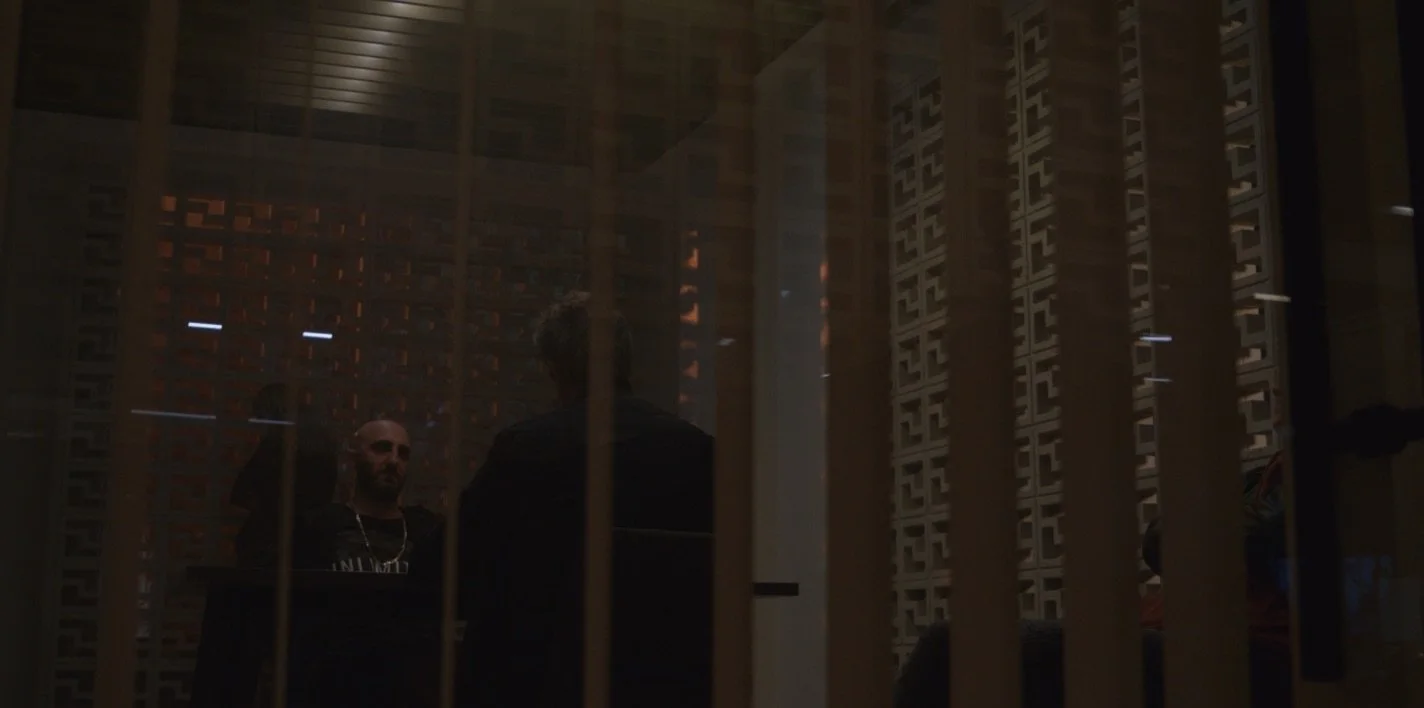
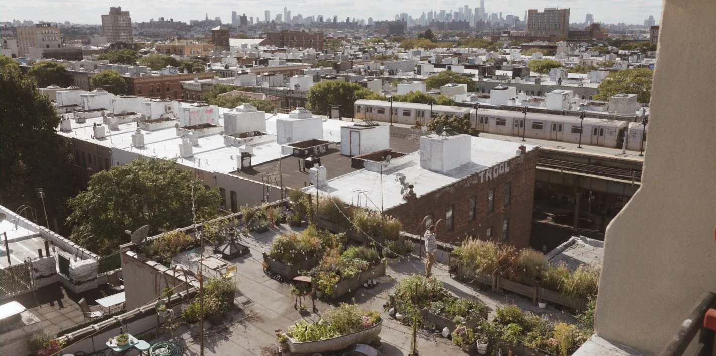
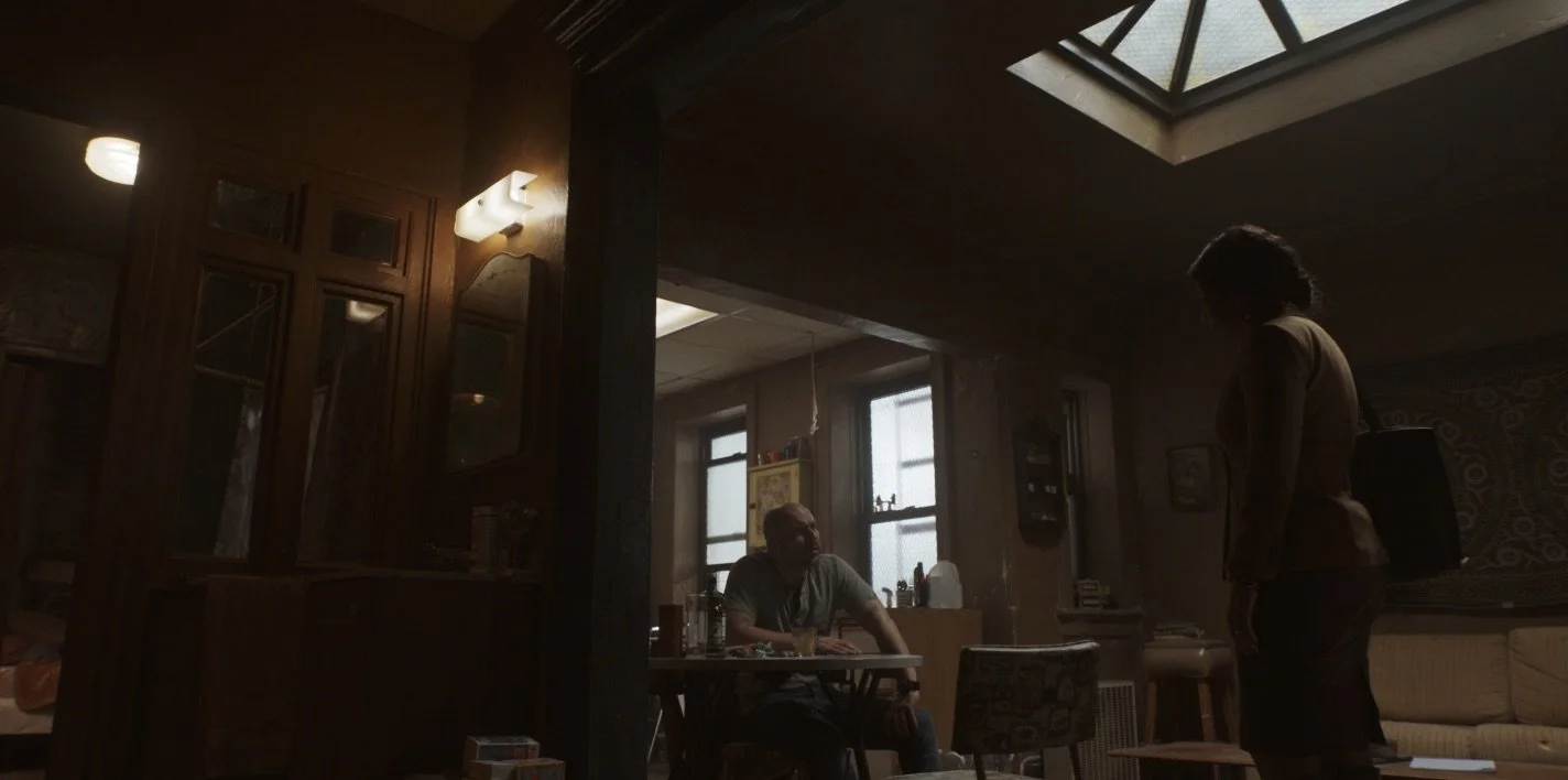
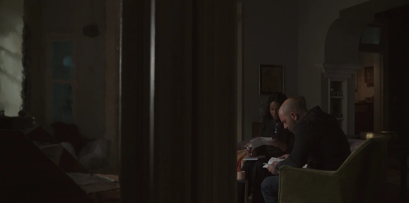
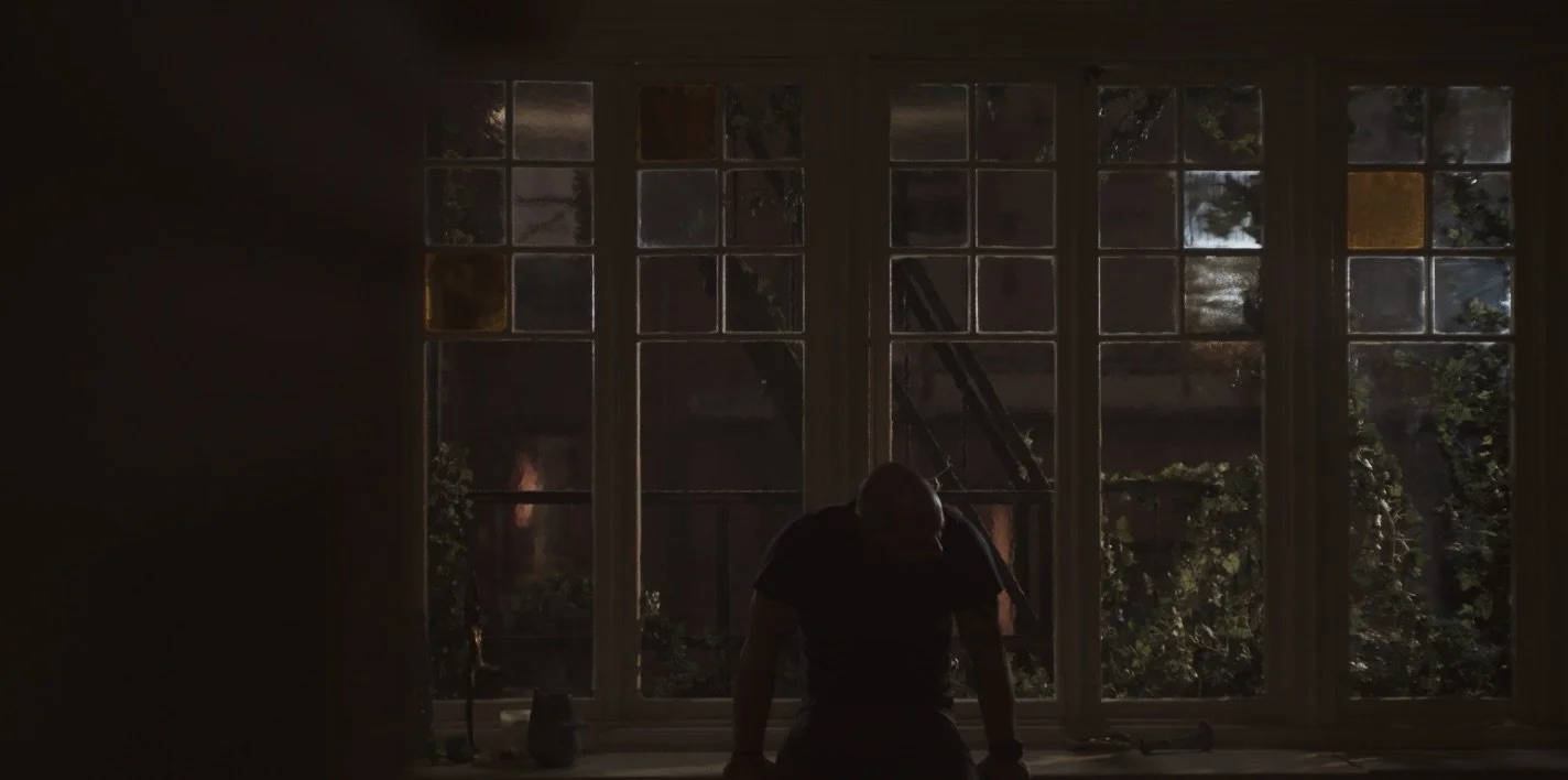
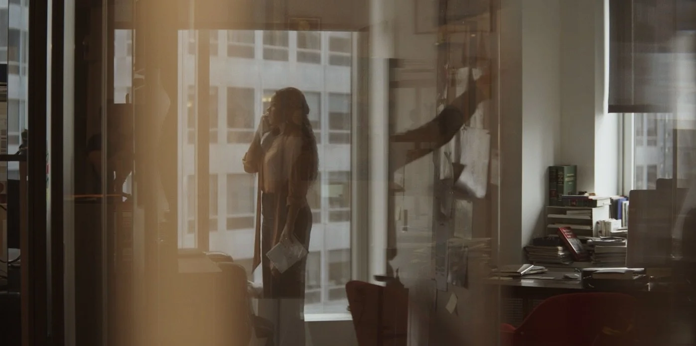
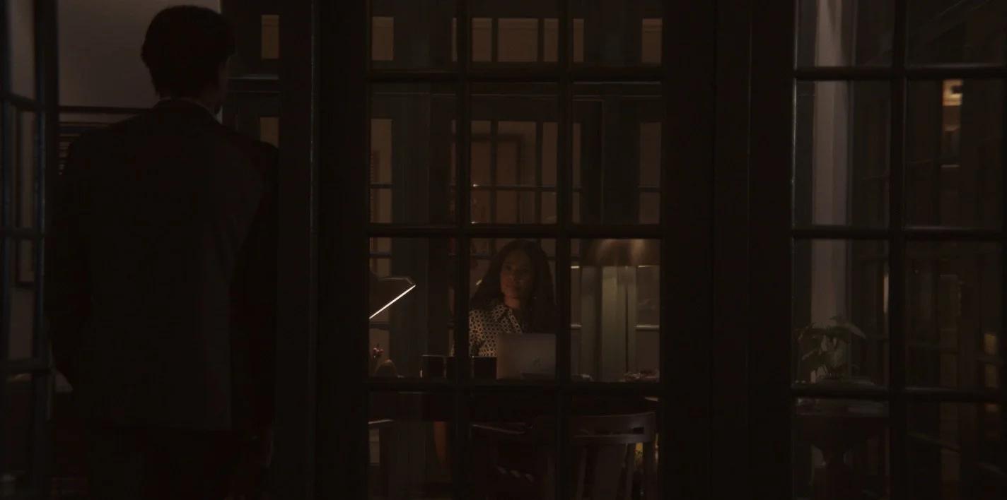
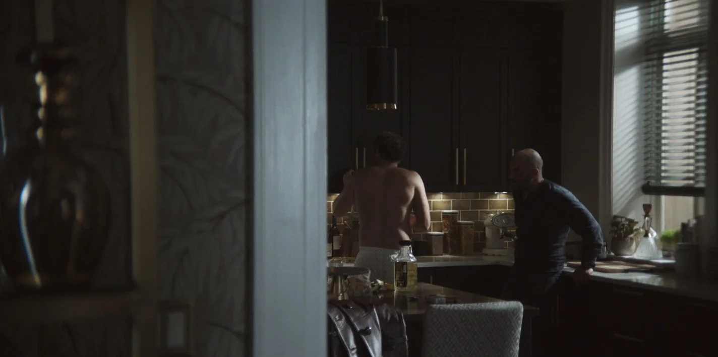
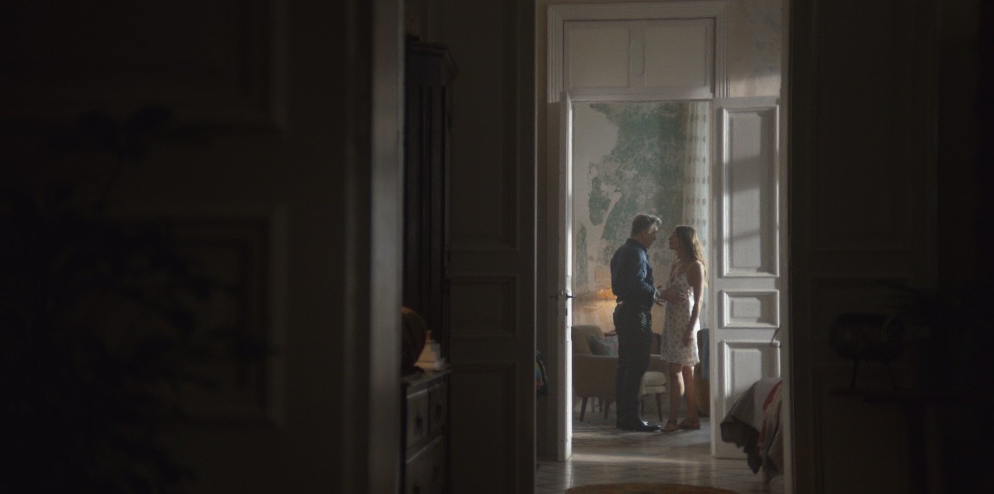
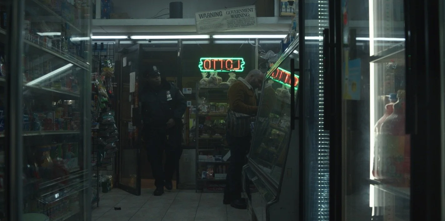
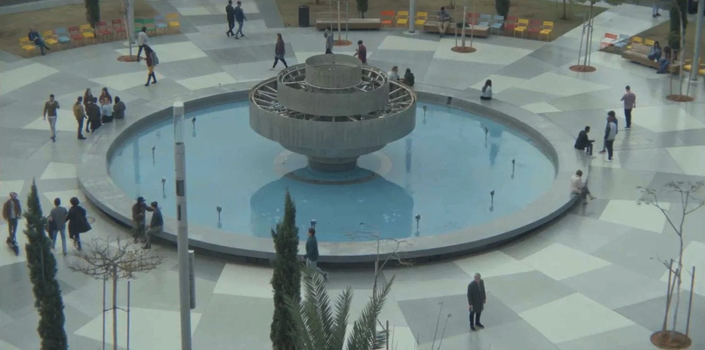
DESIGN CONCEPT // We wanted to invert audience’s expectations of both New York and Tel Aviv, so we focused on the modernism and openness of Tel Aviv, while digging into the grit, oppression, and out-of-date-ness of New York. We embraced the sky in Tel Aviv and blocked it out in New York. We focused on Bauhaus architecture in Tel Aviv, contrasting it with the heavy, rusty infrastructure of New York.
As such, location selection was critical, with the art department curating nearly all of the 150 locations featured throughout the series. This ensured that the visual themes of the series were calibrated and consistent across all 9 episodes.
Production design and cinematography were also in lock-step, collaborating on the style and palette of the series, pulling inspiration from classic 70s films like The French Connection, Klute, and Three Days of the Condor.
HIT & RUN (S1)
9 Episodes // NETFLIX // Showrunners Nicole Yorkin, Dawn Prestwich, Lior Raz, Avi Issacaroff
Producing Director Mike Barker
DESIGN CONCEPT // In order to pull this off, we partnered with the Goodwill Computer Museum in Austin, Texas to rent over 20 computers from the late 70s and early 80s, almost all of which still worked. We embraced the DIY scrappy ingenuity of our characters, making period design choices on a shoestring budget. We leaned into pattern and texture, not only to reference the chess board, but also to add dimension to the black-and-white docu-style footage.
COMPUTER CHESS
Feature // Directed by Andrew Bujalski
*Sundance Film Festival, Winner Alfred P. Sloan Prize
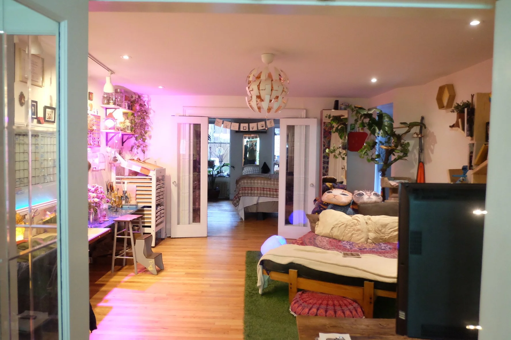
DESIGN CONCEPT // Linda’s existence is repressed and pretty boring. Her world is drained of life, of color, with nothing inspiring surrounding her. She’s child-like, so we often featured baby blues and pinks to show her naiveness. Additionally, we incorporated organic patterns that felt dead and desaturated… as if all the flowers in her life had died. There’s hope yet, however, with small bursts of color appearing as her life takes an unexpected turn.
NATURAL SELECTION
Feature // Directed by Robbie Pickering
*Winner Grand Jury Prize SXSW

